
+- CDBZ Archive (http://alex.zulenka.com)
+-- Forum: Out of Character Forums (http://alex.zulenka.com/forumdisplay.php?fid=8)
+--- Forum: The Legendary Asylum (http://alex.zulenka.com/forumdisplay.php?fid=133)
+---- Forum: Workshop (http://alex.zulenka.com/forumdisplay.php?fid=32)
+---- Thread: Kiro's Display (/showthread.php?tid=8439)
Kiro's Display - Sullivan - 02-26-2007
Quote:Originally posted by Gokua
I'll give you some when I get the time and all. >.< You can't share them with anyone though. ANYONE!
Deal.
Kiro's Display - Sullivan - 03-20-2007

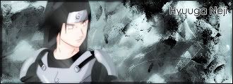




Kenji siggy is my favorite out of those.
Kiro's Display - Yamu - 03-20-2007
Your work makes great use of space, you fill the sig without making it look crowded. Your colors always blend well together though you might try addind some contrast now and then to give a sig a more volitile look.
Kiro's Display - Sullivan - 03-20-2007
=D
Thank you. And I'll take that into account.
Kiro's Display - Sullivan - 03-28-2007
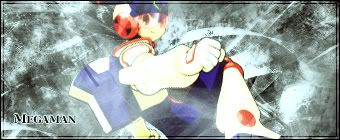
Definitely not my best work. xD

I like this one a lot better, though.
Kiro's Display - Sullivan - 03-30-2007

Kiro's Display - Sullivan - 04-28-2007


Kiro's Display - Sullivan - 06-04-2007

Kiro's Display - Deo - 06-04-2007
So you got time to do that, but not use the picture I sent you.
Whore.
I like it though. It's hazey happy. Makes me think of how his memory is.
Kiro's Display - Kaden - 06-04-2007
Hell yes to a Great Saiyaman sig. You just got so many cool points.
Kiro's Display - Sullivan - 06-05-2007
=D
I try.

Kiro's Display - Mr. Zhu - 06-05-2007
One for teh Fifteenster?
Kiro's Display - Sol - 06-05-2007
You were always one of my favorite sig artists. I don't care about depth, lighting, or any of that other complicated stuff. Your sigs are always really nice in a very simple way, appealing to the eye but not overdoing it. Keep up the good work

Kiro's Display - Sullivan - 06-05-2007
=D
Thanks Tapion, and sure Fifteen. I warn you though. I'm really unreliable with requests, and you could be waiting a day or forever.
Kiro's Display - Kazuya - 06-05-2007
You've gotten really REALLY good, Chuck. =o
Kiro's Display - Sullivan - 06-05-2007
xD
I try.
Kiro's Display - Deo - 06-05-2007

Do it.
Kiro's Display - Sullivan - 06-05-2007
0.o
Specs, of some sort? I can do it tomorrow...probably.
Kiro's Display - Aero - 06-05-2007
Quote:Originally posted by Celipa
First thing that jumped out at me was the quality. The picture's quality isn't all that good, to tell you the truth. I know you like this picture though, so w/e.
Secondly, the flow is a little off. The left side's flow is different from the right side's flow. Now, if this was an abstract piece (Which usually has no picture) it would be awesome, but not in a regular tag.
The colors aren't very awesome, and that's one of the standards of today's tags. If you look at some of my more recent signatures, you'll notice that the colors are pretty good. This can be done with the use of pastel gradient maps (set on soft light). Just play with them and use more than one; you'll get it.
Border's okay. The fad right now is portrait style, but it's a fad, so don't worry about it.
Oh yeah, maybe some lighting with a nice color on soft brush (linear dodge) would be awesome. That's right, had to mention solid lighting. If I didn't no one would have anything to complain about.
Kiro's Display - Sullivan - 06-05-2007
=P
The gradient map is something I contemplated, but I liked the way the sig flowed so I left it. The picture's quality is pretty good, usually, at least I thought so. But I think I might've messed it up with bad lighting. xD
Either way, I like the sig. Even if it has is flaws.
Thanks for the CnC, too. =D