
+- CDBZ Archive (http://alex.zulenka.com)
+-- Forum: Out of Character Forums (http://alex.zulenka.com/forumdisplay.php?fid=8)
+--- Forum: The Legendary Asylum (http://alex.zulenka.com/forumdisplay.php?fid=133)
+---- Forum: Workshop (http://alex.zulenka.com/forumdisplay.php?fid=32)
+---- Thread: Cargo's Display Thread (/showthread.php?tid=10125)
Cargo's Display Thread - Jinpo - 01-28-2007

Cargo's Display Thread - Aqua - 01-28-2007
Quote:Originally posted by Cargo
Good looking image
Cargo's Display Thread - Captain Silver - 01-28-2007
Pretty good. Nice colours, should of used a smaller soft px brush for the lighting though.
Cargo's Display Thread - Jinpo - 02-01-2007

Cargo's Display Thread - Jinpo - 02-05-2007

Cargo's Display Thread - Shun - 02-05-2007
lol he's stickin' out his tongue. That's really good man. Everything goes together perfectly.
Cargo's Display Thread - Captain Silver - 02-05-2007
Quote:Originally posted by Cargo
The text could have been done better, the placement is fine and all but yeah.
The lined brushes you used could have been used much better to, like you could have ued a clipping ask or something to blend. But yeah, it kinda looks like you rushed the brushes over the render, I guess you were trying to create a running motion, I guessed that from the sprayed stroke filters too. It's not a bad sig, but not your best.
Cargo's Display Thread - Jinpo - 02-06-2007
With a little help with ep1c:


Cargo's Display Thread - Captain Silver - 02-06-2007
Stock doesn't fit. I don't like the C4D's/Brushes or w/e you used either.
Cargo's Display Thread - Talys - 02-06-2007
By the way, just so you know what I did it was:
Gradient Maps
Applied Image
Color Balance
Photo Filter
Gradient Maps
Applied Image
Blur on 2 px Set to softlight
Erased some bits
Applied Image
Sharpen
EDIT: Directed at Cargo
Cargo's Display Thread - Aero - 02-06-2007
The c4ds stand out too much. The text doesn't really fit at its location. Personally, I would have found a different pic, because it's kinda hard to do sideview pics.
Cargo's Display Thread - Captain Silver - 02-06-2007
Woah.
Me and Gokua gave the same CnC D:
Cargo's Display Thread - Jinpo - 02-07-2007

Cargo's Display Thread - Olibu - 02-07-2007
I've always hated illustrations of dragons, however, thats hot. Its simple and crisp, not mangled by filters and over the top shit, but still defined. Its very nice on the eyes.
Cargo's Display Thread - Jinpo - 02-09-2007
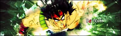
Cargo's Display Thread - Jinpo - 02-27-2007


Cargo's Display Thread - Captain Silver - 02-27-2007
messed up the banana on your LP.
But it's nice.
Try and think outside of the box when it comes to LP.
Everyone always does vector because it looks nice and is easy. But if you do, try and do something other than whatever else does. Otherwise it'll just look like a sheep in a heard.
Cargo's Display Thread - Aero - 02-27-2007
None of them intrigue me, because in all of them you used brushing. Also, it looks like reckless brushing. They're decent though.
Cargo's Display Thread - Jinpo - 02-27-2007
Quote:Originally posted by Gokua
None of them intrigue me, because in all of them you used brushing. Also, it looks like reckless brushing. They're decent though.
I used no brushing in the passion sig. Except for the Light source that is . . .
Cargo's Display Thread - Jinpo - 03-04-2007
