
+- CDBZ Archive (http://alex.zulenka.com)
+-- Forum: Out of Character Forums (http://alex.zulenka.com/forumdisplay.php?fid=8)
+--- Forum: The Legendary Asylum (http://alex.zulenka.com/forumdisplay.php?fid=133)
+---- Forum: Workshop (http://alex.zulenka.com/forumdisplay.php?fid=32)
+---- Thread: ep1c Graphix (/showthread.php?tid=7379)
ep1c Graphix - Captain Silver - 01-29-2007
=0000000
Edit: Go on AIM.
ep1c Graphix - Grandpa Gohan - 01-29-2007
psh
 I wanna learn how to do that, so I can incorperate it into my grunge style! That'd be the shit.
Btw, nice sigs
 I love them
ep1c Graphix - Talys - 01-30-2007

ep1c Graphix - Aqua - 01-30-2007
Quote:Originally posted by ep1c
*explodes*
very, very nice.
ep1c Graphix - Aero - 01-30-2007
Quote:Originally posted by ep1c
Not your best. The red to the right is really distracting me. Maybe a gradient map to make everything around a similar color would work well.
It's still a nice sig though. Good job.
ep1c Graphix - Shun - 01-30-2007
A Mario sig....can be MOWGLI? 8o
ep1c Graphix - James - 01-30-2007
@ Ep1c: What font are you typically revolving around? I can't seem to get that same style with my sigs, think it might do the design some justice if I were to throw that in there instead of those that I have been.
ep1c Graphix - Aero - 01-30-2007
Typically, he uses Arial.
ep1c Graphix - Talys - 01-30-2007
Arial.
Just take it and play with it a lot. Always do something to the text, don't leave it in a plain line. Basic fonts work well.
ep1c Graphix - Talys - 01-30-2007
Couldn't decided which one. . .

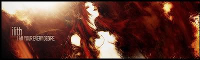
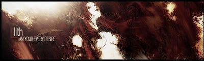
ep1c Graphix - OldNoriAccount - 01-30-2007
So hard to decide. Thanks man. ^_^. Thanks so much!
ep1c Graphix - Jinpo - 01-30-2007
Quote:Originally posted by ep1c
Couldn't decided which one. . .
Either or, but probably the first one
ep1c Graphix - Shun - 01-30-2007
I like the first one best. To me it makes it look more.....vivid? IDK I just like it dammit! lol Great sig. As always.
ep1c Graphix - Talys - 02-05-2007
Quick sprite sig.

ep1c Graphix - Captain Silver - 02-05-2007
Pretty good, a bit vivid and sharp. But yeah.
Edit: *starts makign sprite sig*
ep1c Graphix - Shun - 02-05-2007
I agree on it being bit too sharp but it doesn't seem too vivid to me. Nice job overall man. As always.
It looks like he punched the wall and it broke so debris is in the air. It's cool.

ep1c Graphix - Captain Silver - 02-05-2007
Do you know what vivid even means?
ep1c Graphix - Shun - 02-05-2007
[sarcasm]No I just say things for no reason....[/sarcasm]
ep1c Graphix - Captain Silver - 02-05-2007
Then answer the question. n_n
ep1c Graphix - Banned Chi Chi - 02-05-2007
Technically, he did.
Your question was "Do you know what vivid even means?"
His response was the answer to your question, even though it was sarcasm.
Just thought I'd crash in here and try to pull the fire away from the two of you and aim it at nothingness.
Cool down guys, he gave his opinion, leave him be.
Opinion on the sig.
I LOVE THE BG. Not big on Sprite sigs, but it's cool nonetheless.
I'd say:
Overall: 8.5/10
BG: 9/10
Text: 8/10