
+- CDBZ Archive (http://alex.zulenka.com)
+-- Forum: Out of Character Forums (http://alex.zulenka.com/forumdisplay.php?fid=8)
+--- Forum: The Legendary Asylum (http://alex.zulenka.com/forumdisplay.php?fid=133)
+---- Forum: Workshop (http://alex.zulenka.com/forumdisplay.php?fid=32)
+---- Thread: Mmhm (/showthread.php?tid=9322)
Mmhm - James - 10-08-2006
I was wanting some C&C on my work. I've started to get the hang on Photoshop and have started turning out some of my own which I'd like to possibly make better if I can in any way.




Realize some of them don't have boarders... anyway, that's what I've done thus far in trying different styles and techniques. If anyone has any tips on how I can make any future pieces better that'd be beautiful and most appreciated.
Mmhm - Sol - 10-08-2006
Quote:Originally posted by Son Goten
I really like that one, I think that's by far your best(but I like the goten one a lot too). If you are only "starting to get the hang of photoshop" I'd freakin love to see what you can make after some pratice.
Seriously though, nice stuff.
Mmhm - Sullivan - 10-08-2006
Coola and Vegeta strike my fancy.
You might wanna try blending the images in more...wanna know how?
On the layer you have the image on, there should be an 'opacity' option. Click it, lower it. It'll fade the image a bit.
=)
Mmhm - James - 10-08-2006
@Pikkon: One of my fav's as well, unfortunitely I didn't pick a picture of too good quiality for Veggy. I was going to revamp it should I find a better version of him.
@Selipa: I haven't experimented too much with opacity on images, should give it a shot. =p I did a little on the Goten pic though it is sort of hard to tell, just enough to decrease how bright it was compaired with the background.
Mmhm - Sullivan - 10-08-2006
Anything you need to know Goten, feel free to ask. I know the uses of most of the tools.
Mmhm - Old Pigero - 10-09-2006
Ho' Shit, that is very shmexiful!

Mmhm - Toshiro - 10-09-2006
Got, if you dun get on AIM at the same time as me some time soon.. I will beat you to death with that Koola sig.
Mmhm - James - 10-09-2006
o.O *signs on*
Mmhm - Super Buu - 10-09-2006
That Trunks sig is pretty sexy ... *steals*
Mmhm - Medraut - 10-09-2006
I like the trunks sig and love the font except for the T.
At first, I thought it said, "IRUNKS" lawl
Mmhm - James - 10-09-2006
Quote:Originally posted by Cell Jr.
I like the trunks sig and love the font except for the T.
At first, I thought it said, "IRUNKS" lawl
Looked pretty clear to me. =/ With those small blocks though I can understand what you mean. There was a few other fonts that would've looked good on it but I just threw it up as is.
Mmhm - James - 10-09-2006
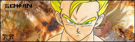
Latest creation for GohGoh, how does it look?
Mmhm - Sullivan - 10-09-2006
I like it. Where can I get those brushes? DeviantArt?
Mmhm - James - 10-09-2006
Yes. Most of the brushes I've used thus far have been from DeviantArt, nice selection in my opinion.
Mmhm - Aero - 10-09-2006
Some good work here.
I like the Vegeta one, but the text seems...out of place. Also, try to use different brushes.