


04-09-2007, 06:18 AM
Version 1:

Version 2:

Which version do you prefer?
Version 2:
Which version do you prefer?
If I were a creeper I would hide in... your closet. Or under your bed, you know, depending on the weather.

 Yet another one (two actually)
|
Yet another one (two actually)
|

04-09-2007, 06:18 AM
Version 1:
Version 2: Which version do you prefer?
If I were a creeper I would hide in... your closet. Or under your bed, you know, depending on the weather.

04-09-2007, 06:42 AM
You really love color.
Idk, I'm sure this will be an opinion that I will share by myself, but it's a little much. Even still, the first one is better. Quote: "for a quarter million a year growing weed, i'd fucking be gay. with dick on the side." - Laura, on mairjuana 
04-09-2007, 06:58 AM
I love it. I think it's totally original, and it's fucking awesome.
I prefer the second one though. The dark bars and stuff provide a nice contrast, plus it gives it that tiny inkling of a "black suit" vibe. 
04-10-2007, 03:41 AM
K, so I am getting back into sig making, so i'm just going to make this my display thread. And with that, here is the new one:
 I'm looking forward to the movie.
If I were a creeper I would hide in... your closet. Or under your bed, you know, depending on the weather.

04-10-2007, 05:02 AM
I think they're both amazing. Wow... just... wow. Especially the first one.
Roster | Character Vault | Last RP
 All things are subject to interpretation whichever interpretation prevails at a given time is a function of power and not truth. -Friedrich Nietzsche 
04-10-2007, 09:58 AM
Remember to add lighting, depth, and flow to your sigs.
Your spiderman sigs have great flow, but they lack depth (because of the style), and have no lighting. Also, they're on the large size, but that's personal preference. The Symbiote Spiderman one is too dark around the render, and the sig has relatively no flow. There's a mediocre lighting source, and there's relatively no depth. That doesn't mean it's bad though. I personally like it.  Placed 3rd in Dante's Abyss 08
04-12-2007, 07:04 AM
Thanks for the comments. They are greatly appreciated.
Here is something for an ongoing project that i'm starting. Not only is it to improve my rendering capabilities, but also in the end I want to have a portfolio of natural and applied beauty. So here is my very first before and after photo... of me!  Not a whole lot of changes were made. Just took care of some skin stuff, made my hair a bit brighter and golden, and some other small stuff. But I'll get better.
If I were a creeper I would hide in... your closet. Or under your bed, you know, depending on the weather.
04-18-2007, 11:45 PM
The second one and agree with what Bra stated. Great job.
04-24-2007, 03:27 AM
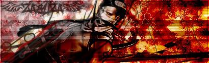 This sig was purely for experimentation. So some things in it are not thought through and on a whim, like the font. But comments are still appreciated. Thanks Bra, Old Selipa, Bido, Aqua, and Gokua for the comments.
If I were a creeper I would hide in... your closet. Or under your bed, you know, depending on the weather.
|
|
« Next Oldest | Next Newest »
|