Posts: 0
Threads: 19
Joined: Apr 2007
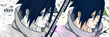
Awrightey...I'm no artist...but I guess I'ma make a gallery...mostly for kicks. Here's a banner I made for my site that's opening pretty soon:
http://i161.photobucket.com/albums/t227/...Final2.jpg
It's okay, I guess....
Posts: 0
Threads: 106
Joined: Jul 2006
Posts: 3
Threads: 153
Joined: Jul 2006
You should try to play around with the blending options when you use gradient maps. Just throwin' them on like that looks ugly. The text is too hard to read and as Jeice said the entire thing is way too blurry. It's good to see you trying though, keep it up. Practice makes perfect. =)
Edit: You should try to do less complicated work, maybe a sig? You had all those random images thrown next to each other it didn't flow right. Empty space is bad but being 'too busy' can be just as bad.
Posts: 38
Threads: 576
Joined: Jun 2004
Like GJ said, try to lessen the load on it. It's heavy blurred, and my guess is you used maybe a guarsin blur on there at some point or another. The gradiant's need to be lessened, and also their blends need to be worked over heavily.
Reiterating what GJ said, start simple. Toy around with effects, and then go for the fully loaded stuff. Don't push your self to hard to fast, or else your gonna get sloppy works. I speak with the air of knowledge on that, some of my stuff at start was absolutely horrid when I tried to get better.
Hunt down some tutorial's from places (deviantART does some good ones) and then work your way though the styles to find one your content with.
Profile
 "Things change. People change. You. Me. Every one of us... Every day of our lives. The day ya' stop changin'... is the day ya' die."
Roster
Posts: 0
Threads: 19
Joined: Apr 2007
Well, again, it's just for kicks.
I'm also not willing to use photoshop, so the majority of it comes from microsoft paint. The rest comes from the "Greyscale" and "Negative" Images from IrfanView.