


06-28-2006, 01:23 AM
You can try and find some pic's for people to try and make them with?
|
Moochi avatar and sig
|

06-28-2006, 01:23 AM
You can try and find some pic's for people to try and make them with?

06-28-2006, 06:14 AM
Post an [Update] Thread in the Q/S/U asking staff to upload that avatar.
[SIGPIC][/SIGPIC]
A decade ago, I never thought I would be, at twenty-three, on the verge of spontaneous combustion. Woe-is-me.
06-30-2006, 07:38 AM
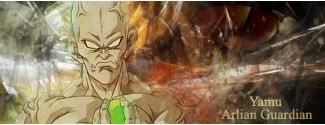
It looks....empty. The sides are too empty. Too....black.
[SIGPIC][/SIGPIC]
A decade ago, I never thought I would be, at twenty-three, on the verge of spontaneous combustion. Woe-is-me.

06-30-2006, 11:32 AM
Toma's right about the emptiness, and the text is awkward.
"We're just two lost souls swimming in a fish bowl."
 
06-30-2006, 03:20 PM
Quote:Originally posted by Torbie You guys are on crack. That sig is hot. Its just the text that bothers me. Whilst the rest looks like its ominous, the text just throws it off. =D  Vad: Found my dicks btw Vad: *DISCS Kaz: XD!!!!XDXDXD!! Kaz: oh man Kaz: that was an awesome typo! Vad: I MEANT ROUND CYLINDRICAL THINGS Kaz: XD XD XD Kaz: HAHAHHHAHHHAHA 
06-30-2006, 03:37 PM
I like it, to put the text into the sig more I would add some BA sayinging flying out from it the same way that 'Moochy' is, it would bring more enrgy to the sides make the text unawkward.
 Dante's Abyss 2007 Runner-Up |
|
« Next Oldest | Next Newest »
|


