Posts: 0
Threads: 80
Joined: Nov 2006
Like before you post a sig, I give CnC. Keep in mind I'm gonna be 100% honest, so don't post if you think you can't take it.
Remember: Only post one and after I've finished with someone else's.
=]
Begin!
Posts: 0
Threads: 106
Joined: Jul 2006
So we post a sig that we made...and you reveiw them? That was probably a dumb question I just want to be clear before I post something lol.
Posts: 0
Threads: 80
Joined: Nov 2006
lol, yesh, that's how it goes.
Posts: 0
Threads: 106
Joined: Jul 2006
Haha k cool...This is one my most recent ones...
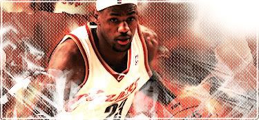
I havn't gotten a real reveiw on it yet, so yeah lol. What do you think?
Posts: 0
Threads: 80
Joined: Nov 2006
The pattern you did ruins the over all look of it all. But it's still pretty nice, you've been improving since I gave you a hard time on SNAPP. I was on you every time you posted a sig. I'm glad you've improved. Quite fast too might I add.
You still have a long way to go, but keep at it and you will get there.
Now onto the actual signature. I dislike the pattern like I said, but it matches the border, which is kinda funky lol. The light source is all wrong, you over did it, but you're using the right method. Try and place it where the light hits his body, just neer it. Not too much though.
But yeah, you're improving.
=D
Next.
Posts: 11
Threads: 86
Joined: Dec 2006
Durka?

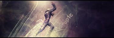
ifth = I Find That Humorous
Posts: 0
Threads: 80
Joined: Nov 2006
Eh, you can do a lot better. It couldn't have taken you very long. It's just a stock background with a sprite. The effects are okay though, I think you used a soft pixel brush, not sure. But over all it has a nice execution. Text is really out of place and needs a lot of work. And personally, I think it'd look better without the border.
Posts: 0
Threads: 132
Joined: Aug 2006

Krillan is drawn and the clown smile in the background is completely drawn over in paint to contrast the same coloring in Krillin.
Roster | Character Vault | Last RP
 All things are subject to interpretation whichever interpretation prevails
at a given time is a function of power and not truth.
-Friedrich Nietzsche
Posts: 0
Threads: 80
Joined: Nov 2006
It's pretty cool. I can't really comment on it because I don't know what you did.
Posts: 0
Threads: 132
Joined: Aug 2006
I drew Krillan, but did it in black and white. I then transposed krillan over an image of a sadistic clown laughing. Then I went through and painted over the clown by hand to create my own desire effect. The text is drawn as well.
here is the stock I used as a proportional reference:

and I'll try to edit in the clown image before my edit time runs out...
and here is the original clown image that I painted over (which is very different from the process of actually drawing Krillin:

Roster | Character Vault | Last RP
All things are subject to interpretation whichever interpretation prevails
at a given time is a function of power and not truth.
-Friedrich Nietzsche
Posts: 0
Threads: 39
Joined: Feb 2006
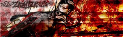
My most recent. Used to experiment with various things.
If I were a creeper I would hide in... your closet. Or under your bed, you know, depending on the weather.
Posts: 0
Threads: 80
Joined: Nov 2006
Quote:Originally posted by Aqua
Krillan is drawn and the clown smile in the background is completely drawn over in paint to contrast the same coloring in Krillin.
That's pretty awesome then. I can't say much because its out side of my area, but great job.
That looks like a combination of various styles. Now, it's vivid. But no too vivid. I like it, aside from the line through the middle, and the faded out Zab's. I would say add depth to make the signature look less flat, but I doubt you could really with this style of signature. It would look odd and same goes for lighting. But its a great signature.
Personally, I'd say work on more sig's like the spidey one. Great job though.
Keep them coming fools. =o
Posts: 0
Threads: 106
Joined: Jul 2006
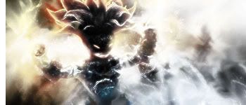
How's about this one...
Posts: 0
Threads: 132
Joined: Aug 2006
Quote:Originally posted by Ballofire
Quote:Originally posted by Aqua
Krillan is drawn and the clown smile in the background is completely drawn over in paint to contrast the same coloring in Krillin.
That's pretty awesome then. I can't say much because its out side of my area, but great job.
That looks like a combination of various styles. Now, it's vivid. But no too vivid. I like it, aside from the line through the middle, and the faded out Zab's. I would say add depth to make the signature look less flat, but I doubt you could really with this style of signature. It would look odd and same goes for lighting. But its a great signature.
Personally, I'd say work on more sig's like the spidey one. Great job though.
Keep them coming fools. =o
You can just say things about the general look of it, you won't hurt my feelings. Whether it's MS paint or photoshop, art should still "look" good.
Roster | Character Vault | Last RP
All things are subject to interpretation whichever interpretation prevails
at a given time is a function of power and not truth.
-Friedrich Nietzsche
Posts: 11
Threads: 86
Joined: Dec 2006
ifth = I Find That Humorous
Posts: 0
Threads: 80
Joined: Nov 2006
It's nice, but its too simple. Even if you were going for that, the effects are minimalist at best, and again the text needs a lot of work. The border has to go, just go borderles and textless for it. Kid Buu also looks like he has been stretched, it has an okay depth, nice choice of colours, but needs better lighting.
I read GJ say he wants to say vivid. But so do I, and don't at the same time. It's a nice signature, just work on execution with certain effects and such.
Posts: 11
Threads: 86
Joined: Dec 2006

EDIT: Ignore the slight mess up in the boarder. . .don't have time to fix that now.
ifth = I Find That Humorous
|