


01-04-2007, 10:24 PM
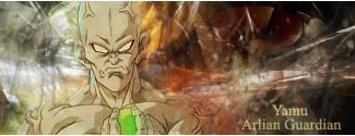
Not knowing exactly what that means, 'cause I'm graphic art stupid, I would say I like the way the lighting extends to the bg with the lighter blues coming off the pics and fading outwards.
Good choice of pics...it almost seems like they would work together better a little further apart, so that the eye lines and attack paths would aim towards each other better.
The only other thing I might change would be the font color so that it would stand out a little better.
Hope that helps, you selfish british git!!!
Dante's Abyss 2007 Runner-Up