





01-09-2007, 02:26 AM
I'll order these 1st to last at the end. For now, reviews, though they will be harsh, I warn you:
Ok, let's start. What does this have to do with bravery... at all, really? 'LIK OMG I REACH' is what I get from it. I know what you were going for with the quote, but it doesn't really do it for me. The background and effects don't match the picture at all. The bright light is annoying. Like KB said, a lack of 'umph.' Not noteworthy.
Ew. Background is a no. Text style and content scares me with the suckiness. Picture doesn't fit... Nothing fits the theme other than the words...
God, there's a lot wrong with this sig. I'm not gonna bother. I don't care if you were using Paint. I use Paint.
Text placement is terrible. It's sort of crammed into the corner there, pushed out of the way by a lame fade-out effect and an overly bright Naruto. The background isn't appealing to me at all, and doesn't really stand out to me. The bright colours really make the sig an eyesore. Medicore.
Yay relatively good sig! Great representation of the theme set before you, and the text, though slightly crammed together, looks slightly shaken, an add-on to the scene. Background is sweet, picture is great... border, not so much. Curved borders give it sort of a cartoony feel. Not appropriate for the sig, really. The 'ki' seems to be a bit messy, but that seems to be what you were going for, so I'll let you off on it.
Plus to you for the unique approach. However, the light in the center is a huge eyesore. It doesn't add to the sig at all, and is just plain annoying to look at. It reminds me of some of Gokua's earlier works. Unlike Gokua's, the border can work here, though I'd still avoid it. Other than that, it seems good.
Ah, Cloud Strife. Nice pose he's got there. Unfortunately, it looks like he just slaughtered a bunch of babies. Not what you were going for? Going for the bloody battlefield? The heroic fight scene? Too bad. He just slaughtered a bunch of babies. Why? 'Cause he felt like it. That's what the background implies. That's the vibe. Baby killing. The text doesn't help, and seems out of place. Like one of those lame voice overs in movies which don't actually apply to the movie at all but are put in anyway 'cause they sound cool. Background is crazy like an 80's movie... Geez.
Congrats! This has ABSOLUTELY NOTHING to do with bravery! Applause! Cheer!
Now, to disregard your complete ignorance of the theme, to the general stuff! This is actually a pretty good sig. Nothing flashy. 'Hidan' doesn't fit, and neither do the other words (since they are completely against everything else [see above]). However, the rest of the sig would be make a good sig on its own. So, everything else is taking it down. Oh well.
What.
The.
Fuck.
How is this bravery? Were you even trying for that theme? I mean, at least some people threw the words in. This gives 'OMG I AM IN HEAVEN' not 'I AM BRAVE OLOLOLO'. I did expect better from you. However, if this wasn't bravery, it would be a pretty damn good sig. The background, though against the theme, is awesome. Picture is great. Border, sweet. Text is the only thing that bugs me. Probably the spacing.
Good sig. Though it doesn't really give me the vibe of bravery, I see what you were going for. However, the background really annoys me. Maybe it's the beams of light. Maybe it's the HORRIBLE COLOUR SCHEME. I don't know. Maybe you'll figure it out. Also, the text bugs me too. And the text content.
But hey, you fulfilled the theme, right? I mean, it doesn't feel it really and it isn't...
I'll shut up now.
Fire =| Bravery.
Other than that, pretty awesome sig. I actually like the colour scheme on this one. Text is medicore, but that's all right. The picture fits the sig pretty well, so I'll just leave it at that.
Ok.
This has nothing to do with bravery either. Getting fairly annoyed about this actually, but it's not just you, rest assured. Other than you not fulfilling the theme, the text is cartoonish, the 'outside the box' trick doesn't work here, I have no idea what you were doing with the background (though it is pretty nice) and, lastly, the picture seems a tad poorly cut.
4th: Gohan
5th: Cell Jr.
6th: Frieza
7th: Paragus
8th: Spice
9th: Yamcha
10th: Tapion
11th: Mr. Buu
Quote:Frieza:
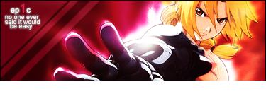
Ok, let's start. What does this have to do with bravery... at all, really? 'LIK OMG I REACH' is what I get from it. I know what you were going for with the quote, but it doesn't really do it for me. The background and effects don't match the picture at all. The bright light is annoying. Like KB said, a lack of 'umph.' Not noteworthy.
Quote:Mr. Buu:

Ew. Background is a no. Text style and content scares me with the suckiness. Picture doesn't fit... Nothing fits the theme other than the words...
God, there's a lot wrong with this sig. I'm not gonna bother. I don't care if you were using Paint. I use Paint.
Quote:Yamcha:

Text placement is terrible. It's sort of crammed into the corner there, pushed out of the way by a lame fade-out effect and an overly bright Naruto. The background isn't appealing to me at all, and doesn't really stand out to me. The bright colours really make the sig an eyesore. Medicore.
Quote:Gokua:
Yay relatively good sig! Great representation of the theme set before you, and the text, though slightly crammed together, looks slightly shaken, an add-on to the scene. Background is sweet, picture is great... border, not so much. Curved borders give it sort of a cartoony feel. Not appropriate for the sig, really. The 'ki' seems to be a bit messy, but that seems to be what you were going for, so I'll let you off on it.
Quote:Cargo:
Plus to you for the unique approach. However, the light in the center is a huge eyesore. It doesn't add to the sig at all, and is just plain annoying to look at. It reminds me of some of Gokua's earlier works. Unlike Gokua's, the border can work here, though I'd still avoid it. Other than that, it seems good.
Quote:Tapion:

Ah, Cloud Strife. Nice pose he's got there. Unfortunately, it looks like he just slaughtered a bunch of babies. Not what you were going for? Going for the bloody battlefield? The heroic fight scene? Too bad. He just slaughtered a bunch of babies. Why? 'Cause he felt like it. That's what the background implies. That's the vibe. Baby killing. The text doesn't help, and seems out of place. Like one of those lame voice overs in movies which don't actually apply to the movie at all but are put in anyway 'cause they sound cool. Background is crazy like an 80's movie... Geez.
Quote:Cell Jr.:

Congrats! This has ABSOLUTELY NOTHING to do with bravery! Applause! Cheer!
Now, to disregard your complete ignorance of the theme, to the general stuff! This is actually a pretty good sig. Nothing flashy. 'Hidan' doesn't fit, and neither do the other words (since they are completely against everything else [see above]). However, the rest of the sig would be make a good sig on its own. So, everything else is taking it down. Oh well.
Quote:18:
What.
The.
Fuck.
How is this bravery? Were you even trying for that theme? I mean, at least some people threw the words in. This gives 'OMG I AM IN HEAVEN' not 'I AM BRAVE OLOLOLO'. I did expect better from you. However, if this wasn't bravery, it would be a pretty damn good sig. The background, though against the theme, is awesome. Picture is great. Border, sweet. Text is the only thing that bugs me. Probably the spacing.
Quote:Piccolo Daimoun:

Good sig. Though it doesn't really give me the vibe of bravery, I see what you were going for. However, the background really annoys me. Maybe it's the beams of light. Maybe it's the HORRIBLE COLOUR SCHEME. I don't know. Maybe you'll figure it out. Also, the text bugs me too. And the text content.
But hey, you fulfilled the theme, right? I mean, it doesn't feel it really and it isn't...
I'll shut up now.
Quote:Gohan:

Fire =| Bravery.
Other than that, pretty awesome sig. I actually like the colour scheme on this one. Text is medicore, but that's all right. The picture fits the sig pretty well, so I'll just leave it at that.
Quote:Spice:

Ok.
This has nothing to do with bravery either. Getting fairly annoyed about this actually, but it's not just you, rest assured. Other than you not fulfilling the theme, the text is cartoonish, the 'outside the box' trick doesn't work here, I have no idea what you were doing with the background (though it is pretty nice) and, lastly, the picture seems a tad poorly cut.
***
Gold

Silver

Bronze

Gold
Silver
Bronze
4th: Gohan
5th: Cell Jr.
6th: Frieza
7th: Paragus
8th: Spice
9th: Yamcha
10th: Tapion
11th: Mr. Buu
