


01-09-2007, 07:57 PM
From first to last:

Gokua:
Your choice in character, stock, emotion, and voice were all consistant with the theme. Also, I feel that your signature flat out looks the best regardless of the theme.

18:
Character, emotion, and voice are consistant witht them theme. The image itself isn't the best, but you did a good job with the theme and the sig itself is well done.

Cargo:
I'm not familiar with the characters and so they didn't exactly scream bravery to me. The image, obviously is a nice one and you work it well into the sig.
Frieza:
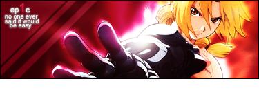
It kinds looks like bravery / anger. I suppose the two collide often. What got you this spot was the nice photoshop work. I like the sig, it just didn't fir the theme the best IMO.

Tapion:
Greta looking sig, but you kind of missed the mark on displaying bravery within the voice / emotion of the sig.

Paragus:
Great job on your first sig. I didn't care too much for the color scheme, but the script placed you over a few of your competitors (or the word choice there in rather).

Yamcha:
The script is hard to read and he looks more angry than brave. Not bad looking overall though.

Spice:
Eh, bonus points for thinking outside of the box but I didn't get "bravery" from this at all. Really good looking stock IMO though.

Gohan:
It was a valliant effort but I'm just not geeling this sig. It's too bright, to jumbled together, and i don't feel bravery coming from the image.

Mr. Buu:
I've done work in paint so I know it can be difficult. But you started off on the wrong foot by picking a poor image. Further, the text and the background are not pretty. They don't look good together, and the text seems jumbled.
Cell Jr:
I can't see an image for you in FF so I can't rank you or offer C & C. Sorry bro.
Gokua:
Your choice in character, stock, emotion, and voice were all consistant with the theme. Also, I feel that your signature flat out looks the best regardless of the theme.
18:
Character, emotion, and voice are consistant witht them theme. The image itself isn't the best, but you did a good job with the theme and the sig itself is well done.
Cargo:
I'm not familiar with the characters and so they didn't exactly scream bravery to me. The image, obviously is a nice one and you work it well into the sig.
Frieza:
It kinds looks like bravery / anger. I suppose the two collide often. What got you this spot was the nice photoshop work. I like the sig, it just didn't fir the theme the best IMO.
Tapion:
Greta looking sig, but you kind of missed the mark on displaying bravery within the voice / emotion of the sig.
Paragus:
Great job on your first sig. I didn't care too much for the color scheme, but the script placed you over a few of your competitors (or the word choice there in rather).
Yamcha:
The script is hard to read and he looks more angry than brave. Not bad looking overall though.
Spice:
Eh, bonus points for thinking outside of the box but I didn't get "bravery" from this at all. Really good looking stock IMO though.
Gohan:
It was a valliant effort but I'm just not geeling this sig. It's too bright, to jumbled together, and i don't feel bravery coming from the image.
Mr. Buu:
I've done work in paint so I know it can be difficult. But you started off on the wrong foot by picking a poor image. Further, the text and the background are not pretty. They don't look good together, and the text seems jumbled.
Cell Jr:
I can't see an image for you in FF so I can't rank you or offer C & C. Sorry bro.
Roster | Character Vault | Last RP

All things are subject to interpretation whichever interpretation prevails
at a given time is a function of power and not truth.
-Friedrich Nietzsche
All things are subject to interpretation whichever interpretation prevails
at a given time is a function of power and not truth.
-Friedrich Nietzsche