01-16-2007, 03:56 PM
Quote:Originally posted by Pui Pui


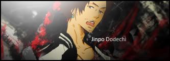
1. Sick, blends very well.
2. My favorite of the 6. Dark, revealing of character. Great job.
3. A little bit bright but still great.
Quote:Originally posted by Pui Pui

4. The left side of the sig is lacking in this one. The big dot and blankness detracts from it.
Quote:Originally posted by Pui Pui

5. Good stuff. Pose matches sig well.
Quote:Originally posted by Pui Pui

6. I'm iffy on this one. The pixely effect is alright I guess but I feel something else could have been done to make it better. I can't tell what though.