02-13-2007, 11:35 PM
Quote:Originally posted by Gokua
meh, more sigs.


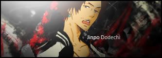
First: Lighting is very well done and it makes the sig. Maybe could have been extended a bit on the left but that is very minor.
Second: The silver bar kills it. Without it, it might be my favorite sig of yours . . . ever. It cuts off the font and that isn't good.