


04-06-2007, 08:51 PM
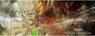
As I said on AIM, (I even looked from a few computers) there is a weird wash-out lighting effect on most of them making them difficult to see. Besides being difficult to see, my only problem is the text looks almost 16-bit, very 'Paint'.
You, as always, have a very distinct style though.
You, as always, have a very distinct style though.
Dante's Abyss 2007 Runner-Up