


04-24-2007, 11:38 PM
Quote:Originally posted by Ballofire
Quote:Originally posted by Aqua
Krillan is drawn and the clown smile in the background is completely drawn over in paint to contrast the same coloring in Krillin.
That's pretty awesome then. I can't say much because its out side of my area, but great job.
That looks like a combination of various styles. Now, it's vivid. But no too vivid. I like it, aside from the line through the middle, and the faded out Zab's. I would say add depth to make the signature look less flat, but I doubt you could really with this style of signature. It would look odd and same goes for lighting. But its a great signature.
Personally, I'd say work on more sig's like the spidey one. Great job though.
Keep them coming fools. =o

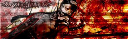
You can just say things about the general look of it, you won't hurt my feelings. Whether it's MS paint or photoshop, art should still "look" good.
Roster | Character Vault | Last RP

All things are subject to interpretation whichever interpretation prevails
at a given time is a function of power and not truth.
-Friedrich Nietzsche
All things are subject to interpretation whichever interpretation prevails
at a given time is a function of power and not truth.
-Friedrich Nietzsche