05-03-2007, 10:57 AM
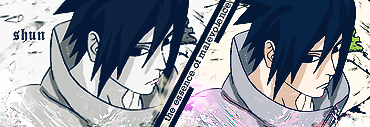
You should try to play around with the blending options when you use gradient maps. Just throwin' them on like that looks ugly. The text is too hard to read and as Jeice said the entire thing is way too blurry. It's good to see you trying though, keep it up. Practice makes perfect. =)
Edit: You should try to do less complicated work, maybe a sig? You had all those random images thrown next to each other it didn't flow right. Empty space is bad but being 'too busy' can be just as bad.
Edit: You should try to do less complicated work, maybe a sig? You had all those random images thrown next to each other it didn't flow right. Empty space is bad but being 'too busy' can be just as bad.