


04-25-2005, 11:06 PM

VS

VS

Subject: Trunks
Theme: Midnight
Font: Anything you want
Judging: Public vote to 5--One person advances

 Workshop Sig Tournament; Android 18 vs Koola vs Raditzu
|
Workshop Sig Tournament; Android 18 vs Koola vs Raditzu
|

04-25-2005, 11:06 PM
VS VS Subject: Trunks Theme: Midnight Font: Anything you want Judging: Public vote to 5--One person advances 
04-26-2005, 12:00 AM
Don't throw a fit if my submission isn't up in record time. I have to reinstall PS.
>.>  "It's on my brain, driving me insane. It's on my mind, all of the time, and if it left... I would be fine."
04-26-2005, 02:00 AM
Quote:Originally posted by Raditzu Yeah, me too. Lost it because of hard drive failure. 
04-26-2005, 02:02 AM
Quote:Originally posted by Koola Shit, that happened to me last time I tried to get it up, too! 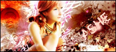
04-26-2005, 02:34 AM
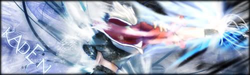
 So... yeah... this is my first sig in a while. I think the sig is pretty self explanitory, but I guess I'm supposed to say something about it. I just picked colors and a font that I felt best fit the theme "midnight." I slapped on a couple of pics and called it good. "It's on my brain, driving me insane. It's on my mind, all of the time, and if it left... I would be fine."
04-26-2005, 02:56 AM
In retrospect, I would have made the color in the border white instead of purple. I like the contrast, personally.
"It's on my brain, driving me insane. It's on my mind, all of the time, and if it left... I would be fine."
04-26-2005, 02:59 AM
The sig overall is good, its just that the text just...burns my eyes...
Must be from not going outside...  
04-26-2005, 03:12 AM
Quote:Originally posted by RaditzuThe pic looks too blended to go with the overall text, and the text is a little too large. Other than that, I like it. *thumbs up*
"We're just two lost souls swimming in a fish bowl."
04-26-2005, 03:13 AM
 Well, here goes. I tried. To symbolize the theme, Midnight, I worked off night time. I based the background off of a dark forest; there is a moon also to symbolize the lateness of the night. The darkness also adds to the mood of the theme. The picture of Trunks that I used is to show him, perhaps, flying through the night, giving that serious mysterious look. I chose a clean font that to me doesn?t clash too much with the background and the picture.  DA08 Winner. "Screw them, this was her show now."
04-26-2005, 03:16 AM
Quote:Originally posted by Android-18Th efont is one of the best I have sene, personally. The border looks very nice, except for near the pic, it stand out too much for me. The pic, I don't know, maybe it could e blended more, or maybe not, but it just doesn't seem right the way it is. Maybe the brightness of it. The background seems to fit "Midnight" very well. Nice job overall, very nice. Is it just me, or are these sigs reminding me of Buffy?
"We're just two lost souls swimming in a fish bowl."
04-26-2005, 03:22 AM
Quote:Originally posted by Android-18 *sexu*
04-26-2005, 03:26 AM
Just a heads up for when Koola does his sig, votes don't open till I open them.
04-26-2005, 05:57 AM
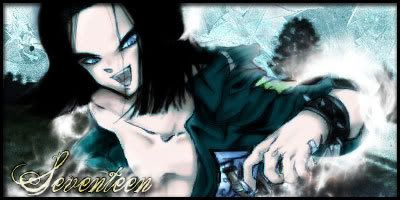
 i had a hell of a time finding pictures... all the sites i used to use are down or dead. i wanted to show night without simply throwing down black and dark colors. i personally think dark is done to death so i did my best to show night without the use of dark colors.
04-26-2005, 06:02 AM
Edit: Sorry voted by accident
 Sage Wrote:Holy shit. The knives and everything.
04-26-2005, 06:03 AM
Quote:Originally posted by Burter
04-26-2005, 06:03 AM
OR OR It was between Koola and 18 for me. Everyone followed the theme. 18 has the sexiest font I've ever seen and had a great concept. However, I'm going to go for Koola here. The "Ghost of Trunks" walking is an amazingly creative idea and I loved how he kind of used a contrast on the right. 1 Koola 0 18 0 Rad First to 5 wins
04-26-2005, 06:07 AM
*votes for 18*
The reason why I vote for her is beacuse her sig is of great quality and it follows the theme, beacuse while Rads follows the theme but is off bad quality, Koolas is of good quality but doesnt follow the theme. Allthought its an interesting view, but still.......... 1-1-0 Sage Wrote:Holy shit. The knives and everything. |
|
« Next Oldest | Next Newest »
|


