Posts: 16
Threads: 102
Joined: May 2006
Character: Yamu
Theme: Pain and excitement
Font: Anything
Images: Max of 2
Sig Restrictions: max height of 200, max width of 500.
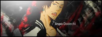
Post sigs in this thread
With it, write a short description explaining how the sig relates to the theme.
GO!
Posts: 59
Threads: 188
Joined: May 2006
Not my favorite sig, that's for sure. Also, it was difficult to find a pic of Yamu that expressed excitement.

 Placed 3rd in Dante's Abyss 08
Posts: 16
Threads: 102
Joined: May 2006
Posts: 59
Threads: 188
Joined: May 2006
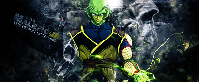
Description:
The red symbolizes blood (Used a blood brush). Blood can be compared to pain, because when people see someone bloody, they think, he is in pain. Now, the excitement basically comes from Yamu's facial expression, smiling. Now, if you add the painful BG with how excited Yamu appears, it adds up to being a sicko basically. Also, the font I chose is call Cocain Sans. It has distorted letters, so I thought it would be a good fit.
the end?
Placed 3rd in Dante's Abyss 08
Posts: 61
Threads: 398
Joined: Oct 2005
Gokua's sig was far from perfect, as he said. I thought it caught the theme well, though.
Bra Wrote:People are dumb, essentially.
Posts: 10
Threads: 585
Joined: Nov 2004
Both sigs are horrible, but Gokua's is less horrible.
So, Gokua.

Mal Nova Wrote:I do apologize for using the word rape. There are four separate definitions for the word rape, two of which describe vegetation...
Posts: 133
Threads: 1,465
Joined: Jul 2002
Gokua's text is hard to read...
I don't think I can vote, but I thought I'd say that, the sig woulda rocked more if the text was more visable.
DA08 Winner. "Screw them, this was her show now."
Posts: 6
Threads: 76
Joined: Aug 2005
Gokua. His fit's the theme, though I agree they could both use work.
Posts: 54
Threads: 358
Joined: Apr 2006
Quote:Originally posted by Krillin
Both sigs are horrible, but Gokua's is less horrible.
So, Gokua.
Reb: ya know
Reb: I think you're a fucking moron OOC
Reb: but I have to hand it to you
Reb: you've become a really great writer
Posts: 80
Threads: 680
Joined: Dec 2002
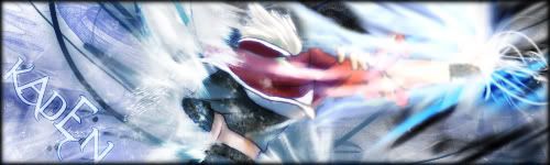
I don't think either sig did a good job of capturing the theme, but I think Gokua's was a little more on-point than Bujin's, even though I like Bujin's more overall.
Gokua
 "It's on my brain, driving me insane. It's on my mind, all of
the time, and if it left... I would be fine."
Posts: 6
Threads: 160
Joined: Sep 2005
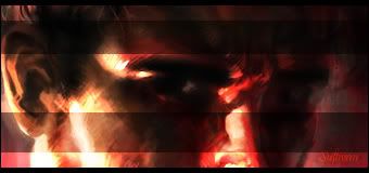
Bujin
The sig is nicely done. Very nicely done. The only thing about it I don't like, is that "The Pain is my Life" is very small. Unreadable practically. But the colors blend well, and I like the Yamu image. Nice job.
EDIT: Also, the text Gokua used for "Yamu" has started to bore me. He overuses it.
"Maria..."
 "...my star...'"
Quote:frickinegg 4:46 pm
To me, the thread is less about criticizing/defending Avatar and more about wondering how stoned Jack was when he saw the movie/made the thread.
Posts: 16
Threads: 102
Joined: May 2006
With a vote of 5-3 . . . the winner is . . .
GOKUA!!!!!
Posts: 133
Threads: 1,465
Joined: Jul 2002
Yeah it is, but aside from size, they were pretty much twins. I don't think it's a big deal to use him.
DA08 Winner. "Screw them, this was her show now."
Posts: 59
Threads: 188
Joined: May 2006
It was difficult to find a decent quality pic of a crazy looking Yamu. 18 is the only person I know that did. Also, I don't overuse that font. That was Cocaine Sans. The one you are speaking of Puar, is 3theHard way remix. Cocain Sans is the one I use in my Gokua sig.
Placed 3rd in Dante's Abyss 08