


07-28-2006, 01:49 AM


Was trying a new style. I want to know if the BG for the Shikamaru sig works. Its made of leaves
 C&C on both is appreciated ^_^
|
Capn's showcase
|
|
07-28-2006, 01:49 AM
Was trying a new style. I want to know if the BG for the Shikamaru sig works. Its made of leaves C&C on both is appreciated ^_^

07-28-2006, 01:53 AM
Ah... I see... someone must have turned off your ability to reply to threads, because, surely, that would be the only reason not to put this in the workshop thread you already have.
I'll go make sure your account hasn't been messed wtih. 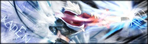 "It's on my brain, driving me insane. It's on my mind, all of the time, and if it left... I would be fine."
07-28-2006, 01:57 AM
Ummm... BJ said we could have a viewing thread and a request thread. These sigs were not requested so I made a viewing thread. That ok? If not I appologize
07-28-2006, 11:55 PM
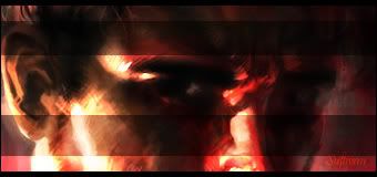
Two more! Did these a couple days ago
 
07-29-2006, 03:53 PM
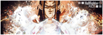
   Three more to show C&C?

07-29-2006, 04:33 PM
The image in the Trunks one, Silver. It's horrible.
The other ones, I like. "Maria..."
 "...my star...'" Quote:frickinegg 4:46 pm
07-29-2006, 04:41 PM
Quote:Originally posted by Captain Silver I never have liked the box style, so . . .  But . . . compared to the others I've seen . . .  Quote:Originally posted by Captain Silver
07-29-2006, 05:10 PM
Shikimaru sig: Alright, the concept is nice but the BG isn't up to par in my book. Try to make a brushed one instead of leaves. It jsut didn't come out right.
Gaara sig: I like the sig, but I feel as if the boxes are in the way of the beautiful. I say you should post it without the boxes. Janemba sig: The pic is too blurry basically. Trunks sig: Same thing. Tapion sig: Nice, though the glow is too large. Try reducing it a bit.  Placed 3rd in Dante's Abyss 08
08-21-2006, 07:42 PM
 a new sig made in PS Elements 2.0. I wish I had my laptop with Elements 4.0. So much easier to work with C&C please? 
08-22-2006, 07:43 AM
Quote:Originally posted by Captain Silver Your text is getting alot better, Silver. The only gripe is that the font doesn't really fit, either that, or make it a lil bigger. But, thumbs up, man. Total badassery.  Vad: Found my dicks btw Vad: *DISCS Kaz: XD!!!!XDXDXD!! Kaz: oh man Kaz: that was an awesome typo! Vad: I MEANT ROUND CYLINDRICAL THINGS Kaz: XD XD XD Kaz: HAHAHHHAHHHAHA
08-25-2006, 05:35 PM
can staff add "and requests" to the end of the title?
and with that... I AM TAKING REQUESTS AGAIN!
08-25-2006, 05:43 PM
Make a sig of someone cooking crack cocaine. I want the text to say: The Alchemist. Everything else is up to you.
Placed 3rd in Dante's Abyss 08
08-25-2006, 06:09 PM
Quote:Originally posted by Gokua ummmmm..... no, PM me if you want to know why I denied it
08-27-2006, 04:34 PM
bump
|
|
« Next Oldest | Next Newest »
|

