Posts: 28
Threads: 61
Joined: Nov 2006
O.o It does.
*didnt realise it before*
Spice if you wanna make another, or whatever,t hen go for it. Otherwise it's Disqualified.
ありがとう人造人間18号
Posts: 0
Threads: 80
Joined: Nov 2006
It does slightly, yes. But yeah, make a new one.
Posts: 3
Threads: 153
Joined: Jul 2006
Spice is hardly ever on, so I'll ask in his place. What's wrong with his?
Posts: 0
Threads: 39
Joined: Feb 2006
Damn. I mistook it's size since it started smaller then the requirements, then I increased the canvas size by inches (I didn't realize it would make so much of a difference.
Thanks Yamcha. And thanks for letting me do another, but I think i'll just reduce the size of the current one.
Again, thank you.
If I were a creeper I would hide in... your closet. Or under your bed, you know, depending on the weather.
Posts: 3
Threads: 153
Joined: Jul 2006
Posts: 0
Threads: 39
Joined: Feb 2006
There.

Thanks again.
If I were a creeper I would hide in... your closet. Or under your bed, you know, depending on the weather.
Posts: 16
Threads: 102
Joined: May 2006
This round is OVER.
Judges, either deliberate and post the results as one list or post your three opinions seperately. How ever you feel is best.
Posts: 0
Threads: 80
Joined: Nov 2006
I will be posting mine soon.
Posts: 16
Threads: 102
Joined: May 2006
Zarbon and Kid Buu will be joining the judges.
Frieza:
Mr. Buu:

Yamcha:

Gokua:

Cargo:

Tapion:

Cell Jr.:

18:

Paragus:

Gohan:

Spice:
Posts: 16
Threads: 102
Joined: May 2006
The sig marked as PD's is Paragus's. My mistake.
Posts: 6
Threads: 160
Joined: Sep 2005
Fixed!
"Maria..."
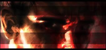 "...my star...'" Quote:frickinegg 4:46 pm
To me, the thread is less about criticizing/defending Avatar and more about wondering how stoned Jack was when he saw the movie/made the thread.
Posts: 0
Threads: 80
Joined: Nov 2006
Cargo:
I've commented on this signature before, I loved it, not only the way it was done. But also how it captures bravery (In my eyes atleast). So, I won't go into to much detail for something I've already gave my reasoning for, but if I must I shall. This is going to be number #1 in my books. Well done Cargo.
Gokua:
Now, this would of been number #1, but it lost it for me when I couldn't put my finger on why exactly this is bravery, I do understand that he is destroying all the Saibamen- blah blah. But, to me...ehhh. However, this signature really is amazing, and I kind of get why you chose it, so that's why it steals second. Great job Baron.
Frieza:
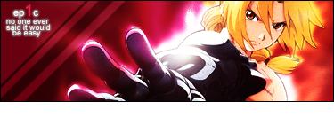
There was something about this signature that did it for me. I love it, I really do. The aura kinda effect behind Ed is amazing. The abstract feel to this sig also, but then again. I wasn't 100% sure what the bravery on this was. But, like Baron's I could get where this is going, so it takes 3rd in my books.
Cell Jr.:
Fucking amazing. Seriously, you have improved so much man. I really love this signature. The blending and fractal used (I could be wrong) is great on this sig man. The text is great, once again, as always not sure what you were going for with the bravery but yeah. This sig is great, and you snatch 4th. Good job.
18:
Becca, I was a bit dissapointed with this, I expected you to win this round. But, meh. No worries. I'm not saying that your sig is bad, because it isn't if this was a round on "Who sig can own who's", you would win. The only reason I didn't bump this up a few ranks is because I have no idea what the bravery was here, I know you tried to capture it with a simple text phrase. But it just won't do it for me. Still, amazing sig.
Spice:
Love it, just love it. Like Naruto, I guess Link can represent Bravery. So yeah. I won't go into to much detail, but this is a great signature, as they always are from you.
Yamcha:
I think you used a tut for this, Frieza's. Yeah, this sig is great. And yeah, I'm a huge Naruto fan, and we all know how he represents bravery, blah blah, but a better image could of made it more braver. Maybe, something like, when he jumped in ront of Iruka or whatever, him standing there pointing don't cut it for me. Sorry dude, but still it's a great sig. Keep up the great work friend =D
Gohan:
You've improved from way back when, but you still have the odd problem. As im getting towards the end of the list im starting to not understand why these are bravery. All I can say really is, I kinda, just a bit, understand. That's all really.
Paragus:
So simular to Tapion's, below this one. The only reason it is just above a bit is because the quote just sang to me. It sells the sig, and won you this rank.
Tapion:
Very. Very, grungy.. I'm not a fan of grungy sigs. But this isn't about how grungy it is, it's about the bravery, now as I said on Gohan's just above this one. I'm not very sure what you were going for ... soo, that's why im placing it here. Still, it's an okay sig.
Mr. Buu:
I don't really understand what you were going for with this one. But I can't be to harsh, this is an amazing sig for Paint. Just keep trying and you will get even better.
-----------------------------
Now, I was a bit dissapointed with some of you, I expected more of the bravery feel, but I think most of you focused on looks. And, oh yeah. I'm sorry If I offended any of you, I tried to be fair but nice. But it's not always easy..
Posts: 35
Threads: 176
Joined: Oct 2004
I'll order these 1st to last at the end. For now, reviews, though they will be harsh, I warn you:
Quote:Frieza:
Ok, let's start. What does this have to do with bravery... at all, really? 'LIK OMG I REACH' is what I get from it. I know what you were going for with the quote, but it doesn't really do it for me. The background and effects don't match the picture at all. The bright light is annoying. Like KB said, a lack of 'umph.' Not noteworthy.
Quote:Mr. Buu:
Ew. Background is a no. Text style and content scares me with the suckiness. Picture doesn't fit... Nothing fits the theme other than the words...
God, there's a lot wrong with this sig. I'm not gonna bother. I don't care if you were using Paint. I use Paint.
Quote:Yamcha:
Text placement is terrible. It's sort of crammed into the corner there, pushed out of the way by a lame fade-out effect and an overly bright Naruto. The background isn't appealing to me at all, and doesn't really stand out to me. The bright colours really make the sig an eyesore. Medicore.
Quote:Gokua:
Yay relatively good sig! Great representation of the theme set before you, and the text, though slightly crammed together, looks slightly shaken, an add-on to the scene. Background is sweet, picture is great... border, not so much. Curved borders give it sort of a cartoony feel. Not appropriate for the sig, really. The 'ki' seems to be a bit messy, but that seems to be what you were going for, so I'll let you off on it.
Quote:Cargo:
Plus to you for the unique approach. However, the light in the center is a huge eyesore. It doesn't add to the sig at all, and is just plain annoying to look at. It reminds me of some of Gokua's earlier works. Unlike Gokua's, the border can work here, though I'd still avoid it. Other than that, it seems good.
Quote:Tapion:
Ah, Cloud Strife. Nice pose he's got there. Unfortunately, it looks like he just slaughtered a bunch of babies. Not what you were going for? Going for the bloody battlefield? The heroic fight scene? Too bad. He just slaughtered a bunch of babies. Why? 'Cause he felt like it. That's what the background implies. That's the vibe. Baby killing. The text doesn't help, and seems out of place. Like one of those lame voice overs in movies which don't actually apply to the movie at all but are put in anyway 'cause they sound cool. Background is crazy like an 80's movie... Geez.
Quote:Cell Jr.:
Congrats! This has ABSOLUTELY NOTHING to do with bravery! Applause! Cheer!
Now, to disregard your complete ignorance of the theme, to the general stuff! This is actually a pretty good sig. Nothing flashy. 'Hidan' doesn't fit, and neither do the other words (since they are completely against everything else [see above]). However, the rest of the sig would be make a good sig on its own. So, everything else is taking it down. Oh well.
Quote:18:
What.
The.
Fuck.
How is this bravery? Were you even trying for that theme? I mean, at least some people threw the words in. This gives 'OMG I AM IN HEAVEN' not 'I AM BRAVE OLOLOLO'. I did expect better from you. However, if this wasn't bravery, it would be a pretty damn good sig. The background, though against the theme, is awesome. Picture is great. Border, sweet. Text is the only thing that bugs me. Probably the spacing.
Quote:Piccolo Daimoun:
Good sig. Though it doesn't really give me the vibe of bravery, I see what you were going for. However, the background really annoys me. Maybe it's the beams of light. Maybe it's the HORRIBLE COLOUR SCHEME. I don't know. Maybe you'll figure it out. Also, the text bugs me too. And the text content.
But hey, you fulfilled the theme, right? I mean, it doesn't feel it really and it isn't...
I'll shut up now.
Quote:Gohan:
Fire =| Bravery.
Other than that, pretty awesome sig. I actually like the colour scheme on this one. Text is medicore, but that's all right. The picture fits the sig pretty well, so I'll just leave it at that.
Quote:Spice:
Ok.
This has nothing to do with bravery either. Getting fairly annoyed about this actually, but it's not just you, rest assured. Other than you not fulfilling the theme, the text is cartoonish, the 'outside the box' trick doesn't work here, I have no idea what you were doing with the background (though it is pretty nice) and, lastly, the picture seems a tad poorly cut.
4th: Gohan
5th: Cell Jr.
6th: Frieza
7th: Paragus
8th: Spice
9th: Yamcha
10th: Tapion
11th: Mr. Buu
Posts: 16
Threads: 102
Joined: May 2006
Standings as of know (1st place get 1, last gets 11, lowest score wins):
Gokua ? 1st (4)
Cargo ? 2nd (9)
18 ? 3rd (10)
Spice ? 4th (17)
Frieza ? 5th (18 )
Gohan ? 6th (19)
CJ ? 7th (20)
Paragus ? 8th (21)
Yamcha ? 9th (24)
Tapion ? 9th (24)
Buu ? 11th(32)
Posts: 91
Threads: 352
Joined: Feb 2004
I just want to say, Gokua, that's awesome.
Posts: 28
Threads: 61
Joined: Nov 2006
ordered from first to last.
Cargo:
This sig is simply amasing. I love it. The one problem I have with it, it feels.. long to me. Though this is comming form someone whos sig's are relatively small. You did a good job breaking away from the normal border, and really softens the sig, which for me, works. It was also the unique approach.
Gokua:
I had a tough time trying to figure out whether I was going to vote this number one, or Cargo's. Anyhow, I love this sig and its simply amazing. Agreeing with Zarbon when I say the rounded edges dont work on this sig, though it's still nice nonetheless. Krillin isnt known for being breave, but this screams bravery to me.
Frieza:
This is starting to look a lot like Tom's list, similar taste perhaps. This doesn't really scream "OMG IM BRAVE WTF", but hey, I relate determination to bravery, and this definitely screams determination.
18:
I don't know what to say Becca. Well, yes I do. The only reason it made it this far up on my list... I duno, something about this sig does it for me, though not as much as the others. Good sig nonetheless, though I expected much more from you(takes time to get back in the groove =P)
Paragus:
I like this sig, a lot. the coloring and BG is nice, and the image of kakashi says bravery to me, don't know why though.
Yamcha:
I dont really like the BG, but thats me. I know you used a tut for this, but its still awesome. Good job. Yeah, Naruto is an icon of bravery, but again I have to agree with Tom, a better pic could've been chosen.
Gohan:
Nice coloring. This is the same as Yamcha though, better pic would've done this sig a lot of justice.
Spice:
I like Link. Link is awesome. But i hate this image, literally. I dislike the bg too, when I first saw it.. iuno, I wanted to beat my head on the wall =( Still nice though
Cell Jr.:
Amasing sig, its really good. the only problem, I dont see the bravery, anywheres =( It screams evil all over, but not bravery.
Tapion:
I love you! Grunge <3 Anyhow, this is the same with CJ. This is more like "death, and rawr" with some mass murder splashed over the sig. Not bravery however.
Mr. Buu:
Yeah. I dont see bravery anywhere in this. If it was carefree, then yeah, it'd be better. A lot of people can make good sigs in paint, kami is probably one of the better people, and certainly the best I know.
ありがとう人造人間18号
Posts: 0
Threads: 132
Joined: Aug 2006
From first to last:
Gokua:
Your choice in character, stock, emotion, and voice were all consistant with the theme. Also, I feel that your signature flat out looks the best regardless of the theme.
18:
Character, emotion, and voice are consistant witht them theme. The image itself isn't the best, but you did a good job with the theme and the sig itself is well done.
Cargo:
I'm not familiar with the characters and so they didn't exactly scream bravery to me. The image, obviously is a nice one and you work it well into the sig.
Frieza:
It kinds looks like bravery / anger. I suppose the two collide often. What got you this spot was the nice photoshop work. I like the sig, it just didn't fir the theme the best IMO.
Tapion:
Greta looking sig, but you kind of missed the mark on displaying bravery within the voice / emotion of the sig.
Paragus:
Great job on your first sig. I didn't care too much for the color scheme, but the script placed you over a few of your competitors (or the word choice there in rather).
Yamcha:
The script is hard to read and he looks more angry than brave. Not bad looking overall though.
Spice:
Eh, bonus points for thinking outside of the box but I didn't get "bravery" from this at all. Really good looking stock IMO though.
Gohan:
It was a valliant effort but I'm just not geeling this sig. It's too bright, to jumbled together, and i don't feel bravery coming from the image.
Mr. Buu:
I've done work in paint so I know it can be difficult. But you started off on the wrong foot by picking a poor image. Further, the text and the background are not pretty. They don't look good together, and the text seems jumbled.
Cell Jr:
I can't see an image for you in FF so I can't rank you or offer C & C. Sorry bro.
Roster | Character Vault | Last RP
 All things are subject to interpretation whichever interpretation prevails
at a given time is a function of power and not truth.
-Friedrich Nietzsche
Posts: 0
Threads: 132
Joined: Aug 2006
Cargo showed me CJ's sig. So just put his sig in sixth place on my ranking and slide the rest down.
Roster | Character Vault | Last RP
All things are subject to interpretation whichever interpretation prevails
at a given time is a function of power and not truth.
-Friedrich Nietzsche
Posts: 16
Threads: 102
Joined: May 2006
Final Standings:
1st: Gokua (7)
2nd: Cargo (13)
3rd: 18 (16)
4th: Frieza (25)
5th: Paragus (32)
6th: Spice (33)
7th: Gohan and Cell Jr. (35)
9th: Yamcha (37)
10th: Tapion (39)
11th: Mr. Buu (54)
The point scale goes from 10 downwards so the point standings are
Gokua: 10
Cargo: 9
18: 8
Frieza: 7
Paragus: 6
Spice: 5
Gohan: 4
Cell Jr.: 4
Yamcha: 3
Tapion: 2
Mr. Buu: 1
Posts: 10
Threads: 129
Joined: Dec 2006
Just as a note, I didn't use paint. I used Photoshop CS2.
|