


01-13-2007, 02:21 PM
Quote:Originally posted by Pui Pui
Learnt some stuff.
Just edited it a bit.

Nice smudging.

Placed 3rd in Dante's Abyss 08
|
[Dung Pile] Crap
|

01-13-2007, 02:21 PM
Quote:Originally posted by Pui Pui Nice smudging. Placed 3rd in Dante's Abyss 08 
01-14-2007, 06:17 AM
I was gonna use a tutorial that Frieza showed me, but I decided to go my own way.
 

01-14-2007, 06:58 AM
 These two I like the best. Great job man as always. Keep up the good work, bro. :] BTW I most likely am gunna use the sig of...the guy lol 

01-14-2007, 08:03 AM
That is unfuckingfair. Seriously. You started off pretty good anyway, but you've only goten better. That Spiderman looks profession, like something marvel would put on their comic. I'm almost sure Yamcha will cream his pants when he sees this.
01-14-2007, 08:13 AM
Quote:Originally posted by Pui Pui Holy FUCKING SHIT. Thumbs up for you, Pui. 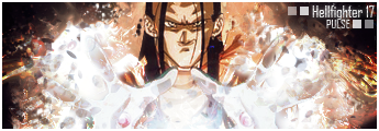
01-14-2007, 08:14 AM
Quote:Originally posted by Pui Pui 1) Spiderdick = pwnage. Seriously, when the fuck did you hit that level of awesomeness in Sig making? 2) TMshirM Hitsugaya, not "ice dude" ya nob head! >.< Regardless, nicely done, not oven blown it, but not under did it either. Nice level of constant. 3) To. Fucking. Bright. Seriously, the other two where good, but that one just looks.. Shite.. Soz.
01-14-2007, 08:24 AM
You know what.. I want you to make me a signature.
Character: Kirano Interpretation: Cloud Strife, preferably, Mwa, mwa, or MWA. Background: I dont know. Try pulling some sexy shit off that looks like a broken window, like you did for the Spiderdick sig. (Thanks for the new word, GohGoh!) Text: Kirano Text2: N/A And can you post a textless version of the signautre too?
01-15-2007, 08:32 PM
Quote:Originally posted by Pui Pui The effect is nice, but I'm not overall a big fan of the pinkenss >.> Quote:Originally posted by Pui Pui Quite nice that is, looks like he's preforming alchemy on his arm though the sig. 
01-16-2007, 03:56 PM
Quote:Originally posted by Pui Pui 1. Sick, blends very well. 2. My favorite of the 6. Dark, revealing of character. Great job. 3. A little bit bright but still great. Quote:Originally posted by Pui Pui 4. The left side of the sig is lacking in this one. The big dot and blankness detracts from it. Quote:Originally posted by Pui Pui 5. Good stuff. Pose matches sig well. Quote:Originally posted by Pui Pui 6. I'm iffy on this one. The pixely effect is alright I guess but I feel something else could have been done to make it better. I can't tell what though. 
01-18-2007, 01:08 PM
Quote:Originally posted by Pui Pui No, you're wrong. This is the best out of your new style. You used good smudging, a good sig size to match the stock, which is also fitting. I see the small amount of c4d you used by his arm, and it was well placed. It doesn't stand out too much, nor too little. It was an excellent addition. Great work. 9/10. Placed 3rd in Dante's Abyss 08 
01-18-2007, 05:52 PM
Quote:Originally posted by Gokua Actually, only thing I'd like to add is the fact that I seriously dislike the white border. Maybe a bit thinner and/or black? >.> [SIGPIC][/SIGPIC]
A decade ago, I never thought I would be, at twenty-three, on the verge of spontaneous combustion. Woe-is-me.
01-18-2007, 06:03 PM
Looks awesome man. Best part imo, is the light though the water.
01-18-2007, 06:20 PM
Quote:Originally posted by Pui Pui Holy sh-...cow...water-cow... You mean you did the dude as well? >.> Or am I hoping too much?... [SIGPIC][/SIGPIC]
A decade ago, I never thought I would be, at twenty-three, on the verge of spontaneous combustion. Woe-is-me.
01-18-2007, 06:45 PM
I rendered him, and edited the hell out of him.
|
|
« Next Oldest | Next Newest »
|


