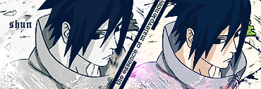
01-18-2007, 06:46 PM
You're hoping too much.
Anyways, it's orgasmic Tom, you've improved much, young padwan.
/star wars
Anyways, it's orgasmic Tom, you've improved much, young padwan.
/star wars
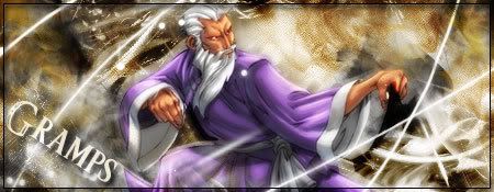
ありがとう人造人間18号
|
[Dung Pile] Crap
|

01-18-2007, 06:46 PM
You're hoping too much.
Anyways, it's orgasmic Tom, you've improved much, young padwan. /star wars ありがとう人造人間18号 
01-18-2007, 07:53 PM
Quote:Originally posted by Pui Pui Mind if I use that? It looks awesome, btw. 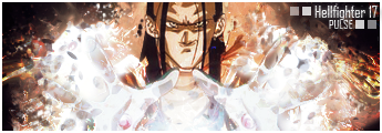
01-18-2007, 09:10 PM
Quote:Originally posted by Pui Pui Just to make sure -- I have permission to add and remove text from it, correct?
01-18-2007, 09:18 PM
Quote:Originally posted by Pui Pui I'm split on this one. I didn't like it at first glance, but after a moment the whole thing settled and it seemed much better. . . 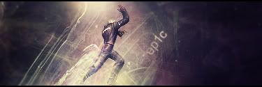 ifth = I Find That Humorous 
01-18-2007, 09:25 PM
Quote:Originally posted by Kirano Correct. Edit: Thanks guys. =)
01-18-2007, 09:29 PM
Quote:Originally posted by Pui Pui Thanks, and, no problem, you deserve it. Those last two sigs were pw/\/4g3 
01-19-2007, 05:15 PM
Quote:Originally posted by Pui Pui Second one, and remove the smudging stuff (so the swords are like in the first one) over the swords, so they stand out a lot. Then we're talking ZAWESOME! [SIGPIC][/SIGPIC]
A decade ago, I never thought I would be, at twenty-three, on the verge of spontaneous combustion. Woe-is-me.
01-19-2007, 05:32 PM

01-19-2007, 05:39 PM
Hmm...
In that one it seems a bit too clouded over, which takes away from the stock. Also, the text seems to be a mere look over, instead of actually being visible. Maybe some sharpening of the stock would bring this alive. That and better text placement. I think you know me long enough to know that I only mention the bad. And when I do that, it means that everything else seems okay in my eyes.  Placed 3rd in Dante's Abyss 08
01-19-2007, 06:24 PM
Quote:Originally posted by Pui Pui Looks good, thou the image of the guy is slightly hard to make out clearly. Quote:Originally posted by Pui PuiIt's good. I like how the image stands out alot more then the following two. Thou I really dun like the zaggy lines on the swords. Quote:Originally posted by Pui PuiThis one is the best of them by far. I like how it stands out, yet also looks like some sorta dust storm has picked up around it. Quote:Originally posted by Pui PuiIt looks like some sorta sand storm just splashed across it. I dun like it.
01-19-2007, 10:26 PM
Quote:Originally posted by Pui Pui This one is better. Colors work more. 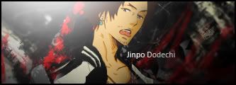
|
|
« Next Oldest | Next Newest »
|