


01-23-2007, 01:45 AM

TADA
|
[Dung Pile] Crap
|

01-23-2007, 02:24 AM
That Wolverine sig is pure ownage, though I wouldn't have done the multi-color aura effect. Seems weird with wolvering for some reason. On the flip side, it works out amazingly with the MB sig, which is equally kickass.
8/10 fo' both. 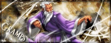 ありがとう人造人間18号 
01-23-2007, 09:26 PM
Quote:Originally posted by Pui Pui I don't think the render blends well. The text is cool though. 

01-23-2007, 09:56 PM
I'm not a fan of the new disco effect on the sigs. Though, that goes with the understanding that my preference may be different from someone elses... but I feel like all the light is taking away from the stock rather than enhancing it.
Roster | Character Vault | Last RP
 All things are subject to interpretation whichever interpretation prevails at a given time is a function of power and not truth. -Friedrich Nietzsche 
01-23-2007, 10:06 PM
They aren't disco effects..
They are C4D's >.<
01-23-2007, 10:08 PM
Bleh, you say C4Ds I say exploding light of 1970's godiness.
>.<
Roster | Character Vault | Last RP
All things are subject to interpretation whichever interpretation prevails at a given time is a function of power and not truth. -Friedrich Nietzsche 
01-26-2007, 09:21 AM
Aka your font/type in general(?) needs a little work.
 DA08 Winner. "Screw them, this was her show now."
01-26-2007, 10:21 AM
I said it before, and I'll say agai nwith that sig.
the text placements bugs me to hell. shift it >.> 
01-26-2007, 09:33 PM
Quote:Originally posted by Pui Pui If used properly, yes. Now, on that precious Halo sig of yours... Well, it looks all fine and dandy, until wait! WTF is that gray crap near the bottom with the scanlines on it!? OMG! I...am...so...distracted. I...can't enjoy the rest...of the sig.. I think you get the point with the comment above. The text could have been placed somewhere else. Maybe on his armor, or motion blurred or w/e. Anything would have been better than placing it on some blob.  Placed 3rd in Dante's Abyss 08
01-26-2007, 09:36 PM
I think we covered that it sucks, we don't need more than one saying it.
01-26-2007, 09:45 PM
It doesn't suck at all. If you can just remove the weapon and text, it would pwn.
Roster | Character Vault | Last RP
All things are subject to interpretation whichever interpretation prevails at a given time is a function of power and not truth. -Friedrich Nietzsche |
|
« Next Oldest | Next Newest »
|


