


02-01-2007, 09:32 AM
Quote:Originally posted by Aqua
Quote:Originally posted by Pui Pui
There's a VERY NICE one!

Fixed.


|
[Dung Pile] Crap
|

02-01-2007, 09:32 AM
Quote:Originally posted by Aqua Fixed.

02-01-2007, 12:41 PM
I see you're finally using that tech brushset I sent you. Sweet.
Nice job.  Placed 3rd in Dante's Abyss 08 
02-01-2007, 12:42 PM
Nah, I downloaded it this morning. But yeah, you sent me it before rebooting of thy PC.
>.>
02-01-2007, 05:38 PM
The pic is a little glossed. I'd give it a sharpen. Then, after that edit>sharpen fade>50%
Placed 3rd in Dante's Abyss 08
02-01-2007, 05:40 PM
I know what to do kthx, I prefered it like that.
02-02-2007, 02:27 PM
Lighting is too bright. The arrows seem as if they don't belong. Also, nice attempt with the text, but leaving it normal(and with a smaller size) would have looked better.
Placed 3rd in Dante's Abyss 08
02-02-2007, 02:34 PM
Quote:Originally posted by Pui Pui !!!!!1!1!!1111eleven1`1!!11~~``1~$!$@!!!11! Ownage. I dont like the one before it though. The colors in this one seem to blend in, and give it that "I'm in a dusty ruin hiding from the local authorities and dont come after me cause I'll bust your ass look," one of my favorites. I like the light effect at the top, and how it looks like he's walking into the light and glancing back into darkness. Could use a better font though, one slightly less basic, but no cursive crap. 8.7/10 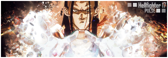
02-02-2007, 02:50 PM
Quote:Originally posted by Pui Pui Tom, how many times do we have to keep telling people this? Lol. Placed 3rd in Dante's Abyss 08 
02-02-2007, 04:37 PM
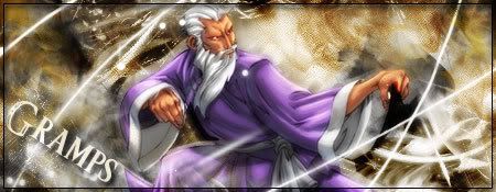
Text seems out of place, you could've chosen a better place to put it.
 ありがとう人造人間18号
02-02-2007, 04:39 PM
Thanks for focusing on the faults. Ignore the good.
02-02-2007, 05:33 PM
Quote:Originally posted by Grandpa Gohan Yeah, it's what I do with lesser sig makers. =x |
|
« Next Oldest | Next Newest »
|


