


02-05-2007, 08:15 PM

|
[Dung Pile] Crap
|

02-05-2007, 08:36 PM
Quote:Originally posted by Ballofire Move the lighting to the left more. Also, the shapes in the right corner seem out of place.  Placed 3rd in Dante's Abyss 08 
02-05-2007, 08:40 PM
Quote:Originally posted by Gokua Hmm...what he said...except maybe the shapes thing...only noticed when I was really paying attention... Oh, and I suggest making the text darker, rather than lighter than the background...dunno, just seems it'd fit in better. Or at least add something like a shadow effect to add a bit of contrast... Just my 0.0002$ x 10. [SIGPIC][/SIGPIC]
A decade ago, I never thought I would be, at twenty-three, on the verge of spontaneous combustion. Woe-is-me.

02-05-2007, 09:26 PM
It's a style of sig, if I change that it wouldn't be the style.
I could have been nasty and said what I planned to, but meh. 
02-06-2007, 12:36 AM
Quote:Originally posted by Ballofire I think more of the render needs to be in the sig. 
02-06-2007, 12:48 AM
It was a small image, and arms, bit of body and head was all that was there. Sorry, I can't draw on the rest ~_~

02-06-2007, 01:04 AM
Quote:Originally posted by Ballofire You definitely could've drawn it you slacker!! Great sig big bro. I agree that the render should be more in there if it was a bigger render... since it's not that's friggin' great! It all blends together very well, my only problem is that some of the text is cut off. I can see why you did it though because that placement would be perfect, so you made it as close to perfect as it could get.  Edit: !! 
02-06-2007, 07:37 PM
I don't share a lot of my work with you people =P well heres some stuff you don't get to see :o
This one is for a SOTW that I'm in:  This one is for a friend on a gfx site:  Those are pretty different styles to what nearly all of you are used to D:
02-06-2007, 07:44 PM
8o Holy shit....didn't you say you hated pink or something like that?
 Both of those are amazing. Like all your work is but ...damn those two IMO pwn everything else. I didn't think you could out do the other spidey sig...but I was wrong.. wooh... 8o Edit: 8o *in shock* Edit2: Mostly for the spidey one though.
02-06-2007, 07:47 PM
I love pink. But I had to use it for a theme.
02-06-2007, 08:40 PM
It may just be me being tired at 10 PM with little to no sleep over 2 days, but...it takes me like...half a minute to a minute to actually see the render...o_o
*goes to bed* [SIGPIC][/SIGPIC]
A decade ago, I never thought I would be, at twenty-three, on the verge of spontaneous combustion. Woe-is-me.

02-06-2007, 08:49 PM
<nazi>
I'll be frank on this(an no I haven't been schemeing a bad review for you since my gaara sig), both these sigs suck. At least compared to your better sigs. The text, could've been done much better, and the box that it sits on with the drop shadow sucks, and it doesnt fit the sig at all. The lines and circles... They feel like they don't belong in this sig, also they make it feel cluttered. I like the border, but it could've been done better. =\ I kinda like this sig, but only to a point. I like the dusting, it definitely gives the sig a good flow. The text seems like it was slapped on, If you had made it like it was graphed onto the circle, it probably would've looked better too, or if you had made it so it went with the dusting. I don't get why you put the door in the bg  Not like he's about to leap out or something. Overall I guess it's a good sig, but definitely sub-standard to what you've been doing. </nazi> It's not incredibly... in depth or anything, but I just dont feel like writing more. 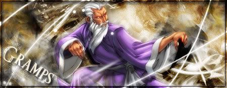 ありがとう人造人間18号
02-06-2007, 09:24 PM
Meh, I wont say what I was gonna say.
=P
02-06-2007, 09:29 PM
Quote:Originally posted by Ballofire I like everything but the text. Maybe moving the block and the text down some would look better. Placed 3rd in Dante's Abyss 08
02-06-2007, 09:34 PM
Thank you for some positive stuff.. and like, yeah.
02-06-2007, 09:42 PM
Oh, and lowering the opacity on the drop-down shadow. The shadowing looks nice, but maybe lessening it would be better. Just my 2 cents.
Placed 3rd in Dante's Abyss 08
02-07-2007, 03:58 AM
Quote:Originally posted by Ballofire That they're better than my sigs? Maybe. Doesn't change my oppinion however. ありがとう人造人間18号 |
|
« Next Oldest | Next Newest »
|
