Posts: 0
Threads: 80
Joined: Nov 2006
Well, anyway. I'm really bored, so if anyone wants to post a sig up and I'll give it hardcore CnC. Don't get pissed if I'm to harsh though, I'll try not to be. Ask if you want a rating to, and remember, only one signature at a time, don't post two or three. And while I'm CnC'ing someone, don't post till I'm done.
K, go.
D:
Posts: 3
Threads: 153
Joined: Jul 2006

Edit: What ya' think?
Posts: 0
Threads: 80
Joined: Nov 2006
It's an okay signature for your level.
The text could have been placed a lot better and more visible too. I have a problem with the image, you could have made this much better with filters. And, you could have put more effort into the BG instead of covering it in white, and using a blur and lighten trick on it. Or whatever you did, I think you did a sharpen filter to. Not sure. But yeah, you could have used a few gradient maps to blend the stock to make it much much cooler. There isn't much more to say about it, but you could have done better and that this isn't your best signature.
Edit: Next.
Posts: 3
Threads: 153
Joined: Jul 2006

Edit: Can you give a rating for this one please? I am not trying to fill up your thread btw I just honestly want CnC.
Posts: 0
Threads: 80
Joined: Nov 2006
Meh, I don't care.
Looks like something I would of made a while back. It's okay, a bit to bright image wise, the text is to small, but works for some odd reason. The aura effect is dull, yet also works. I know how you did it, but yeah. It's a nice sig, nice size for what it is. Better than your last Deadpool sig by far, Only thing you could have done to make it better was add a darken gradient map to dim it down a tad. And maybe a underwater photofilter, then a nice sharpen filter. It's not bad, better than the Hulk tho.
Posts: 7
Threads: 35
Joined: Jan 2007
You pretty much give me CandC all the time, but if you're bored...

Posts: 0
Threads: 80
Joined: Nov 2006
The white looks nice with the golden flaires. However, the render in my own opinion lets this signature down a lot. The size of the signature is a good fit, and the blending is a poor job, you could have used the feather feature. But I'm guessing you don't know of it yet seeing as you're new, but because of that, it is an amazing sig for a newbie. The text is bland, and boring, youl could have made it smaller, since the sig it's self is small. Buit yeah, a better render and stuff would have been better.
Posts: 7
Threads: 35
Joined: Jan 2007
Wee! lol, I love getting C and C from you experts, it really helps.

Posts: 11
Threads: 86
Joined: Dec 2006
Yeah, I want two:


ifth = I Find That Humorous
Posts: 0
Threads: 80
Joined: Nov 2006
Jesus, no one reads the rules!
I said wait till I'm done with one, then you may put up your sig, and only one...
srsly.
I'll post up the CnC for those 3 in a bit.
Posts: 0
Threads: 80
Joined: Nov 2006
Flows bad in this one, it just seems all over the place, which isn't a good thing. The stock image is really bad to, you couldn't have helped that because yo uahven't learned any tricks to clean them up just yet. The slatter bruh you used seems to have a sharpen effect on it, along with the text, it doesn't fit. The sig isn't bad, because I can see the concept of it, so with that it bumps the average score up. Good work.
I love how you did this one, I know exactly how you did it to. A few C4D's on a smudged canvas with text. You could have used a black and white gradient map then set it to darken then lower the opacity to 85%. Just to blend those odd coloured C4D's. Also, you could have shapended it up a bit better. And placed the texted better. But this is a really good sig.
I love it, the sprayed stroke filter really works well on the signature. But, I don't like the over sharpen effect on the sig. The text is a bit fadded, but it works. The part of the left is blured and looks a bit like water with a spatter effect. The sig is great so yeah, not much CnC. But it could have been better.
---
Next.
Posts: 3
Threads: 153
Joined: Jul 2006

I'm back!! 
Posts: 0
Threads: 80
Joined: Nov 2006
To. Pink.
Why does everyone assosiate Buu with pink? It's rediculous. Srsly. But meh, the filters you used were okay, bit to sharp, not to vivid. The stock sucks ass, not the image, I mean, it's just there man. You made now effort to edit it. Looks like you used lumonosity on it. Try experimenting and break away from the pack of average sig makers by using clipping masks and other stuff. Filters wont draw you apart. The text is good, I don't like how you did the spiritken text, it's just there. The size of the signature- height wise is lame. Edit the canvas size and use a curved border. And god man, change the gradient maps. When I said this is your best sig, I lied. It's your best sig at filters.
Posts: 59
Threads: 188
Joined: May 2006

Be merciless.
 Placed 3rd in Dante's Abyss 08
Posts: 0
Threads: 80
Joined: Nov 2006
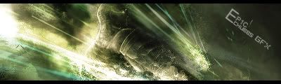
I hate grey scale, doesn't look to bad on this one though. The text is nice, looks like movie lights kinda thing, goes with the signature quite well. The background is quite nice, although I don't like the black and qhite squares at the bottom. I think you must of used a clipping mask on this sig, looks nice. The BG looks a tad to sharp, not over done or anything, but yeah. The render looks ruined though, not shaprness wise, but cracked. It doesn't looks very good. The lighting effect could have been done much better, and placed better. The black vector lines on the left I hate, they're to dark, do not fit in with the sig. Overall, you have done better in the past, but still, this is a great signature.
Posts: 16
Threads: 102
Joined: May 2006
Posts: 28
Threads: 61
Joined: Nov 2006

Whore, you're taking too long to CnC these. Bumping/adding
>.> I really wanna know where I went wrong with it and where it could use some improvements, anything else that could be added, ect.

ありがとう人造人間18号
Posts: 0
Threads: 80
Joined: Nov 2006

Very, uh, bland. The stock could have been placed much better, and you could have used the good ole feather tool to blend it in. But it's not a bad sig, but srsly not your best. The vector brush you used around the text was a nice idea, but could have been done better. The background for this one looks random, so the flow and depth in this sig is rather bad. The text needs a lot of work, and the scale lines have got to go.
Now you're trying a new style, so I won't be too harsh. The stock is a bit blured, but I've used that render and it isn't the easiet to work with. The clipping mask was a nice touch, but you should of erased that horrid stock duplicate in the background. I'm not sure how you did your clipping masks, but don't use large brushes, try using stuff like splatter brushes. But, man, you're on your way to becoming a fine graphics artist. The text needs some work to tho.
Posts: 7
Threads: 35
Joined: Jan 2007
Posts: 0
Threads: 80
Joined: Nov 2006

Ew, movie bars do not go well with this, at all. The signature in height is way to tall for my taste, the width is okay. The text, I hate, not a fan of misc fonts, try editing your default fonts with the character editor. The brightness of this signature is way to horrid, it hurts my eyes to look at, It all makes me loose focus rather fast, which I hate. There isn't a very decent focal point either. Also, whoever taught you the gaussian blur trick, with lighten or w/e, should of also told you, not to whore it, it is to be used with certain sigs, and to be erased on some parts. I can't even see the brush work, but it looks like you just clicked a few times with the same brush, and added the render and coloured it. You should try and add more detail into the signature too. I can't really say anything I like about it, because, well there isn't. =/
|